As we creep closer to Halloween, we’re diving into the spine-chilling UX mistakes that make your visitors want to scream… and not in a good way. Whether you’re running a Swindon-based website or looking to improve your branding and graphic design, avoiding these common UX horrors can keep users engaged and coming back for more.
The Zombie Attack of Never-Ending Pop-Ups
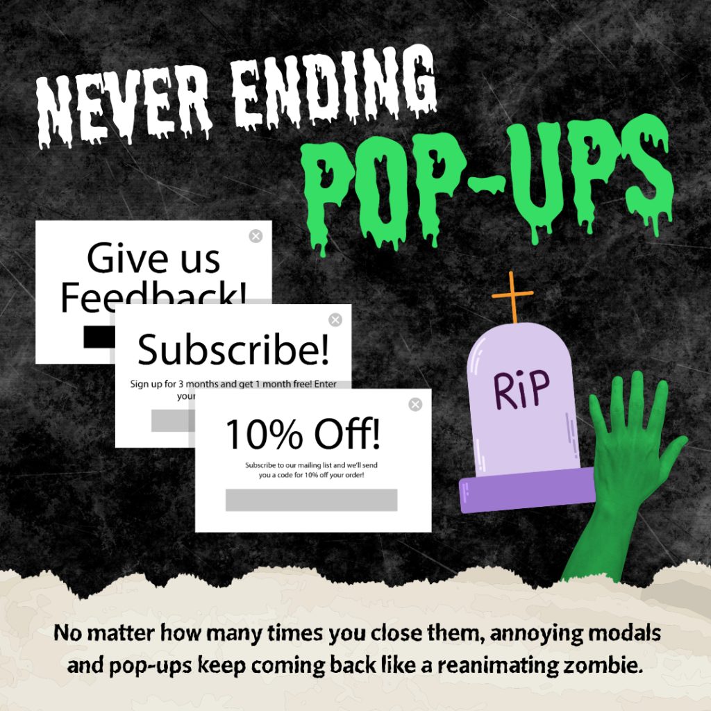
“Get 10% off! Sign up now! Give us feedback!” – Some pop-ups and modals seem to have lives of their own, continuously resurfacing no matter how often you close them. This zombie-like persistence can push visitors away faster than you can say “unsubscribe.”
Jump-Scare Autoplaying Videos
Autoplaying videos with sound – truly the digital version of a jump scare. If your site welcomes users with unexpected noise, it’s a surefire way to see them flee. Avoid scaring users off and let them choose to press play.

Haunted Old-School CAPTCHAs
From “Select every stop sign” to “What’s 16 + 39?”, CAPTCHAs from the past can frustrate users, adding barriers where none are needed. While security is essential, a haunted CAPTCHA can cost you more than it saves.
Endless Forms of Doom
Simple form? Think again. More required fields than expected – full name, address, phone number, and your grandmother’s maiden name – can leave users feeling drained. Keep forms short and sweet to avoid the dreaded “abandoned form syndrome.”
Dark Shadows of Poor Colour Contrast
Low-contrast colours are a nightmare for usability. Dark backgrounds with dim text can leave users squinting, struggling, and eventually… leaving. Opt for high-contrast colour schemes that make reading effortless, no flashlight needed.

The Maze of Broken Links
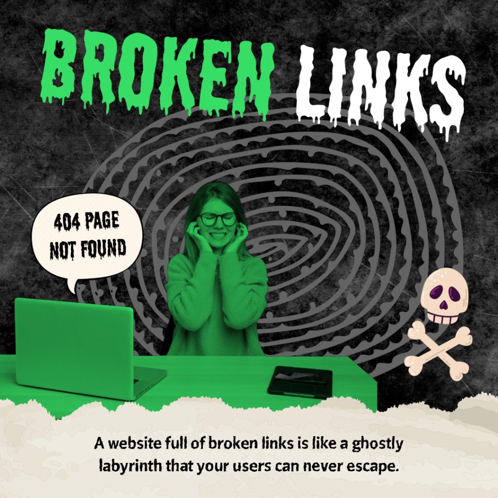
A website littered with broken links is like a ghostly labyrinth. Each “404 not found” leads your users down dead ends, with fewer making it back. Regularly check links to keep visitors moving forward, not running in circles. And while you’re reviewing your content, consider why great images are a must for your website to create a visually engaging experience that keeps users interested.
The Torture of Slow Load Times
When it comes to web pages, time is of the essence. A slow site feels like a taunting ghost, making users wait while they consider an escape. A fast-loading site means happier users and better SEO performance.
The Terror of Ignored Responsive Design
Nothing says “nightmare” like a non-responsive design. Users on mobile are met with cramped layouts, tiny text, and navigation that’s nearly impossible. Mobile-friendly, responsive design ensures your site looks sharp on all devices, keeping users from the horrors of a poorly designed page.
Don’t Let Your Site Give Users a Fright
A user-friendly, responsive, and visually appealing website is essential to keep visitors engaged and connected. Swindon Web Creations is here to help ensure your branding and graphic design are optimised for all devices and audiences. This Halloween, let’s scare away poor UX and keep users delightfully engaged – no tricks, just treats.


