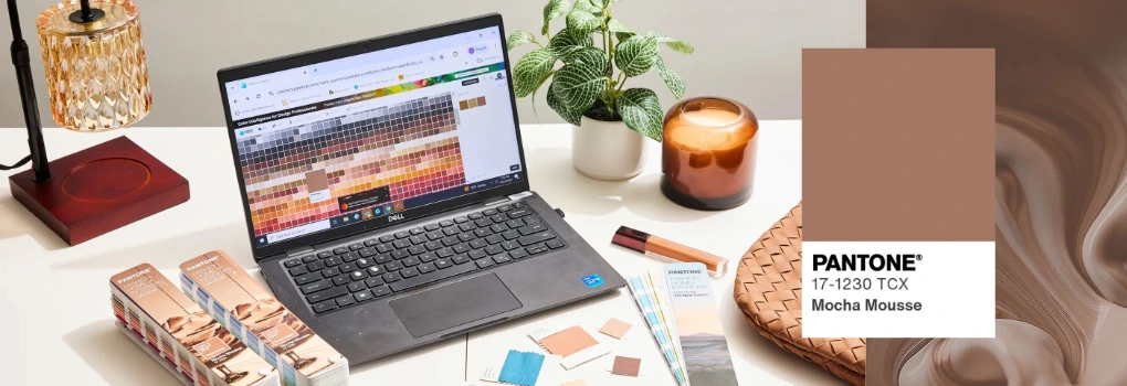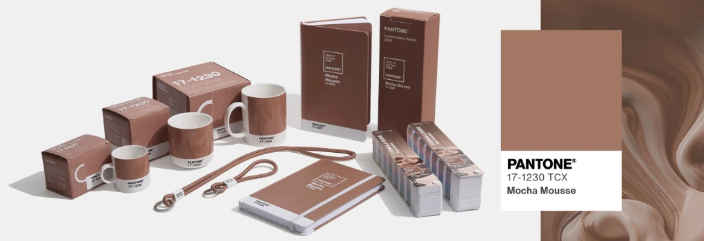
The Pantone Colour of the Year is always a highly anticipated announcement, setting the tone for design trends across industries. For 2025, Pantone has chosen Mocha Mousse, a warm and sophisticated shade that embodies comfort and versatility. In this article, we explore the significance of Mocha Mousse and its applications in branding, web design, and print.
Why Mocha Mousse Was Chosen
Pantone’s selection of Mocha Mousse reflects a collective desire for stability and groundedness in a rapidly changing world. According to the Pantone Colour Institute, this earthy tone strikes a harmonious balance between modernity and tradition, making it an ideal choice for businesses aiming to convey trust, warmth, and reliability.

Characteristics of Mocha Mousse
Mocha Mousse is a rich, medium brown with subtle grey undertones. This sophisticated yet neutral hue can work in a variety of design contexts, from bold and striking to minimalist and understated. Its versatility makes it suitable for a wide range of brands, offering a sense of stability without sacrificing style.
Branding Applications:
Mocha Mousse is perfect for branding materials like logos, business cards, and packaging. Its timeless appeal communicates reliability and professionalism.
Web Design Inspiration:
In web design, this hue works well as a background colour or as an accent paired with soft whites and muted greens for a modern aesthetic. To start using this versatile colour within your website design, use the hex code #A47864.
Print and Marketing Materials:
For print, Mocha Mousse adds depth and sophistication. Think brochures, flyers, and posters that exude understated elegance. To incorporate Mocha Mousse into your branding, use the following CMYK colour values: C: 33 | M: 53 | Y: 60 | K: 9.

Key Takeaways and Tips:
- Incorporate Thoughtfully: Mocha Mousse is best used as a complementary colour. Its balanced tone works well when paired with lighter shades or contrasting colours.
- Pairing Suggestions: For a calming effect, combine Mocha Mousse with soft pastel tones. For a more dynamic look, consider pairing it with vibrant hues for striking contrast.
- Test Across Mediums: Ensure the colour performs well in digital and print formats by testing against various lighting and materials.
Conclusion
Mocha Mousse isn’t just Pantone’s Colour of the Year for 2025; it’s a versatile, timeless shade that perfectly captures the current design needs of businesses. Whether you’re refreshing your brand’s look or embarking on a new project, Mocha Mousse offers a stylish yet grounded hue that can help elevate your creative work.
Pairing it with the right typography can further enhance its impact—check out our blog, 10 Must-Have Free Fonts for Designers in 2025, for inspiration on how to complement this trend-forward colour with cutting-edge typefaces. The possibilities are endless, and this colour is set to make a lasting impression.


