Maintaining brand consistency is more important than ever for small and medium-sized businesses (SMEs). A strong and recognisable brand is not just about a catchy logo or an eye-catching website—it’s about how all aspects of your Swindon business present a unified identity.
This is where brand guidelines come into play. Brand guidelines help ensure that your business is represented consistently across all channels, from your website to social media, and even in printed materials. By establishing these rules for how your brand should look, sound, and feel, you can build trust, enhance recognition, and solidify your brand’s place in the market.
What Are Brand Guidelines?
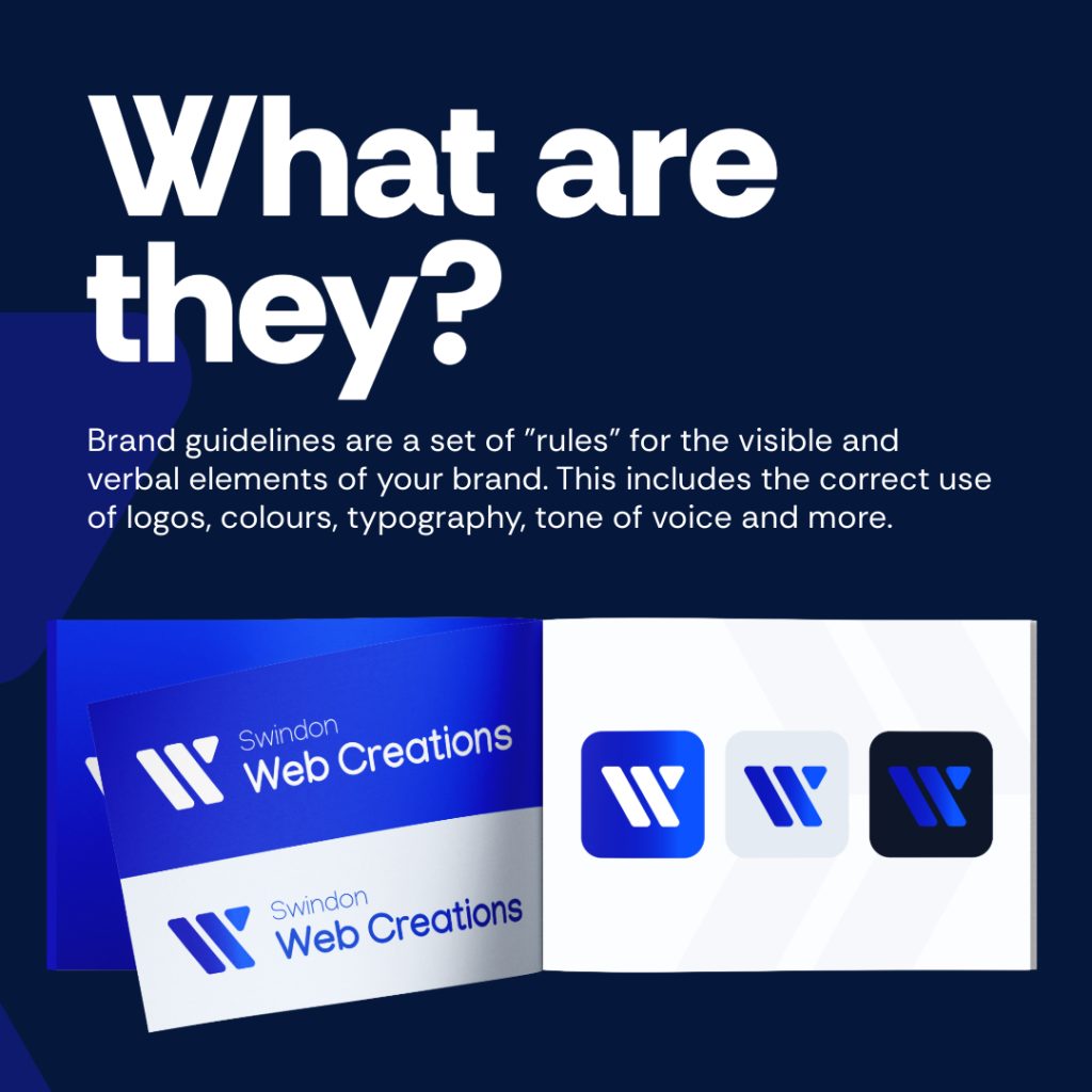
Brand guidelines are essentially a rulebook for how your brand is communicated visually and verbally. They ensure that everyone working with your brand—whether internally or externally—maintains a cohesive and unified approach. These guidelines are important for businesses that work across multiple platforms and have various team members or partners contributing to their branding efforts.

A well-constructed brand guideline document will outline all of the key elements that make up your brand’s identity, including:
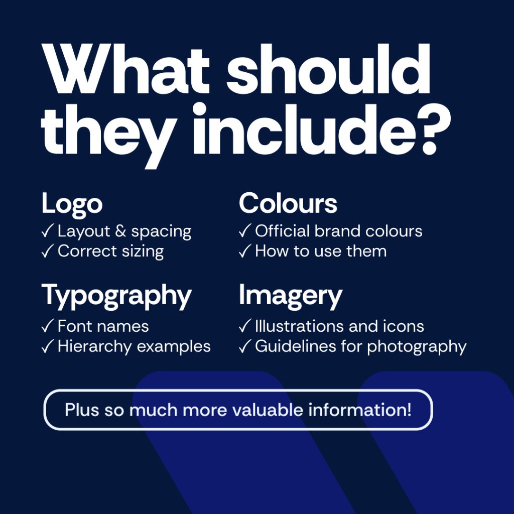
- Logo usage: Defining the correct size, layout, and spacing of your logo to ensure it is always presented in its best light.
- Colours: Specifying the official colours of your brand, complete with hex codes and rules for when and how these colours should be used.
- Typography: Confirming which fonts are part of your brand’s identity and providing examples of text hierarchy to maintain consistency in all communications.
- Tone of voice: Establishing the style of communication that aligns with your brand’s personality, ensuring that every message conveys the right tone.
These are just some of the key components that form part of your brand guidelines, but let’s dive deeper into each of these elements to understand their significance.
What Should Brand Guidelines Include?
Logo
Your logo is often the first point of contact between your business and potential customers. To ensure that your logo is always presented correctly, your brand guidelines should clearly outline its usage. This includes the correct sizing, acceptable colour variations, spacing around the logo, and any restrictions, such as not distorting or altering the logo in any way.
For example, you may have a primary logo for most instances and a secondary, simplified version for smaller placements like social media icons or mobile apps. Clear guidance on when to use each version ensures consistency and prevents any misuse that could dilute your brand’s identity.
Colours
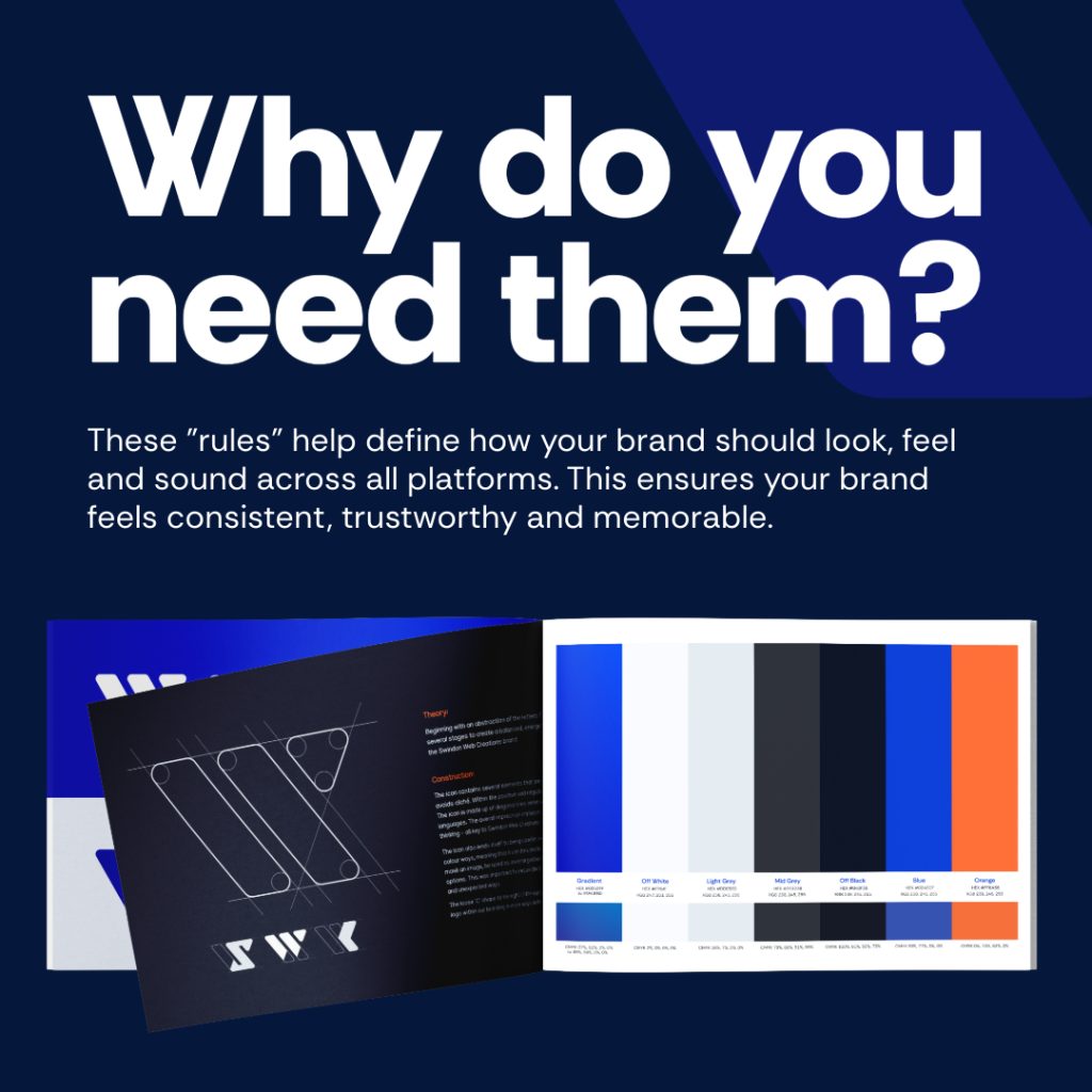
Your brand’s colour palette is a vital aspect of its visual identity. Your brand guidelines should define your official colours, including their hex, RGB, and CMYK values for both digital and print formats. Additionally, your guidelines should explain how these colours should be used—whether it’s to maintain a particular tone or mood or to differentiate between different sections of your website or marketing materials.
For example, a brand might use a primary colour for the main elements and a set of complementary colours for accents, ensuring a harmonious yet recognisable look.
Typography
Typography plays a significant role in how your brand is perceived. Your brand guidelines should detail which fonts are used for headers, body text, and other typographical elements. By setting rules for font size, weight, and spacing, you can create a consistent visual hierarchy that guides the viewer’s eye and strengthens your brand’s identity.
For instance, a brand may choose a bold sans-serif font for headers to convey strength and clarity, while using a lighter serif font for body text to offer readability and sophistication.
Imagery
The imagery used in your branding—from photographs to illustrations and icons—also needs consistency. Your brand guidelines should provide clear examples of the types of images that align with your brand’s values and tone. This can include everything from the style of photography (e.g., bright and airy, or dark and moody) to the kind of illustrations that best represent your brand.
A consistent imagery style helps create a cohesive look across all your marketing materials, making your brand more recognisable and memorable.

Why Brand Guidelines Are Crucial for Consistency
Brand guidelines are not just for large corporations—they are essential for businesses of all sizes. For SMEs, consistency in branding builds trust with your audience. When your brand looks and feels the same across all platforms, it conveys professionalism and reliability. This consistency also enhances recognition; the more familiar your brand becomes, the more likely customers are to remember and engage with it.
Inconsistent branding, on the other hand, can confuse your audience and diminish the impact of your marketing efforts. Imagine if your website used one set of fonts and colours, but your social media posts looked entirely different. This lack of cohesion can make your business appear disorganised and unprofessional, ultimately driving customers away.
Real-world examples demonstrate the power of consistent branding. Think of well-known brands like Coca-Cola or Apple—regardless of where you encounter these brands, their visual and verbal identities are always consistent, making them instantly recognisable and trustworthy.

If you’re ready to take your brand to the next level with cohesive and professional brand guidelines, our expert team at Swindon Web Creations is here to help. We specialise in creating tailored branding solutions that align with your business goals and resonate with your target audience. Contact us today to schedule a consultation and let’s work together to build a brand that stands out and remains consistent across all platforms. Give us a call or drop us an email – we’d love to chat about your next big project!


